ResponseTek Dashboard
Project Summary
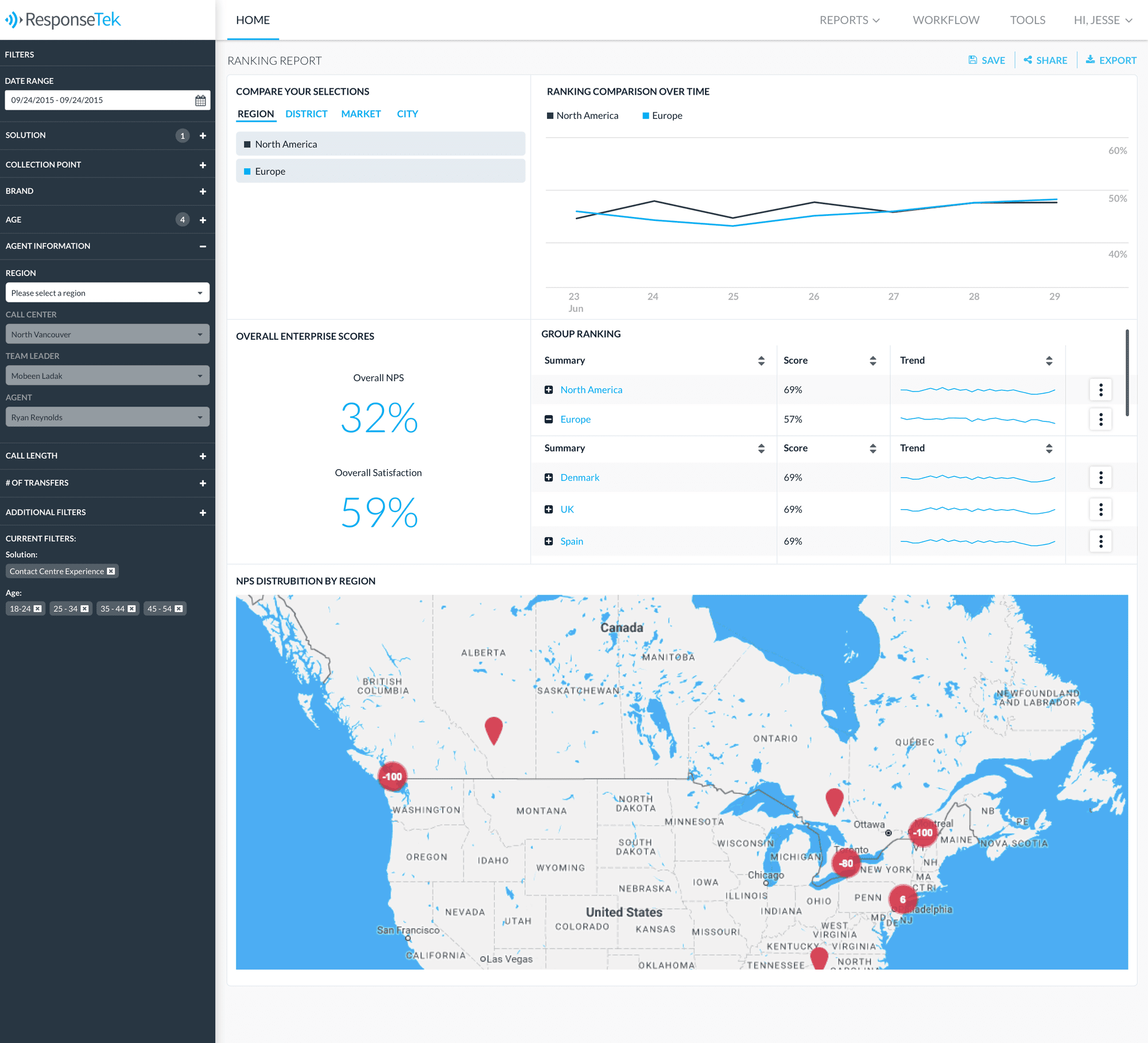
The ResponseTek dashboard needed to be redesigned. Some key aspects that I needed to focus on improving were the way filtering works and the visual look of the data we were presenting. We also had massive amounts of data that we needed to find ways of presenting to our users.
My Role
Product Design, User Research, Persona Development
The Team
Product Manager, 2 Senior Developers, 1 Intermediate Developer, 2 Junior Developers
Tools I Used
Sketch, Invision, Atom, Flinto, HTML, CSS
This project had many different stakeholders so it was important to first learn from interviews with clients and client service staff. I wanted to find out what was working and not working for them, what kind of reports they were manually creating and how they were filtering through their data.
I really wanted to help our dev team feel more connected to our customers and dashboard users. I began to build personas based off of real conversations and clients to help them understand just who they were building these products for.
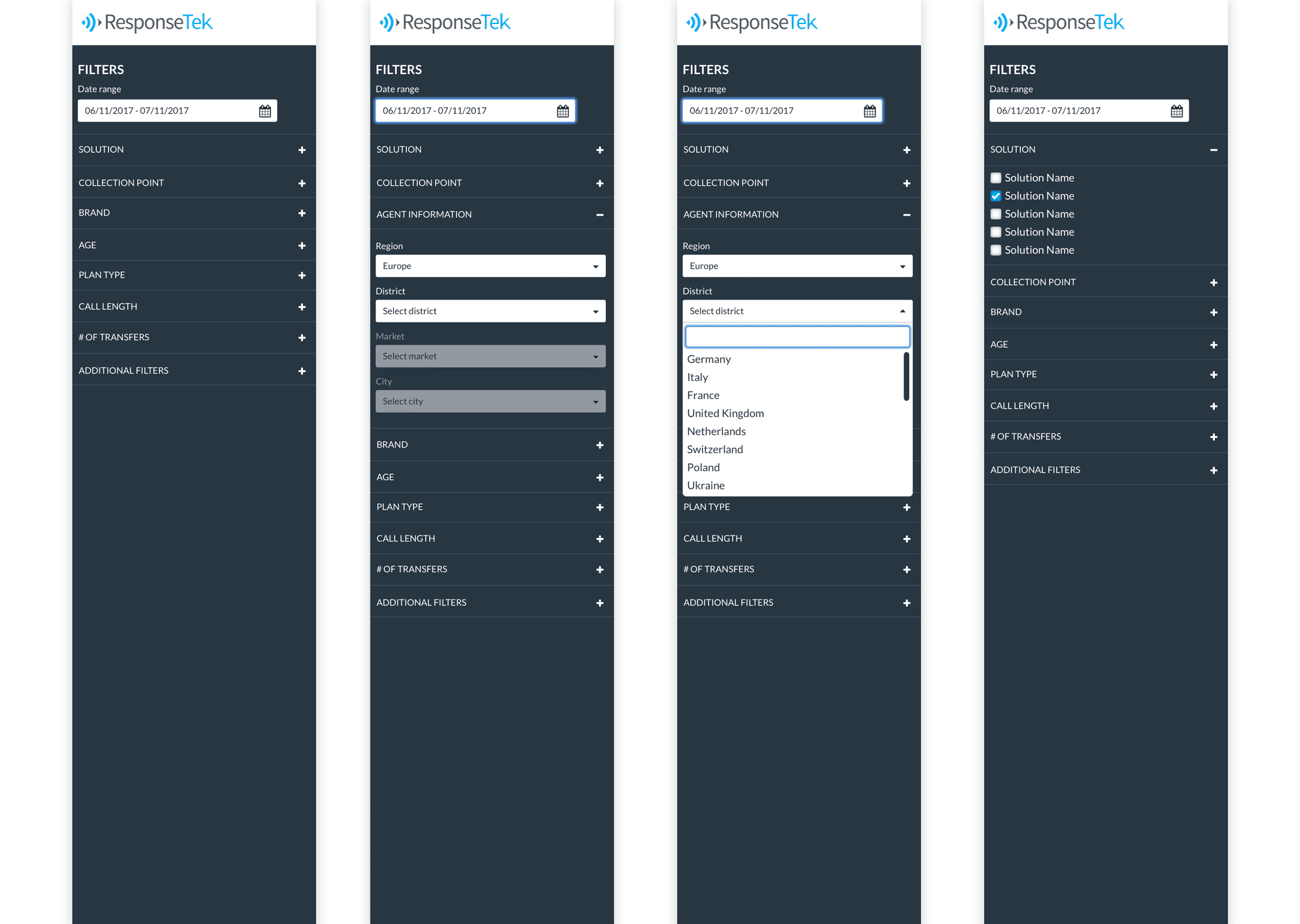
Prototyping was a major component to what I did with this project. I had created some early prototypes with Invision that I let clients try out. The initial feedback I received really helped me plan how this project would unfold.
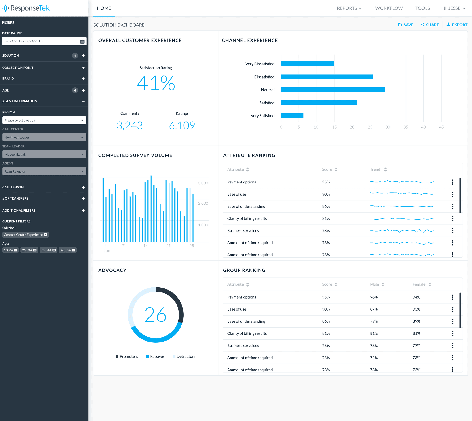
ResponseTek has a tremendous amount of data coming into their system for all of their clients. When speaking with our clients it was clear there was a need for an array of different kinds of reports. Our new framework and tools allowed us to build reports at a much faster rate for them.
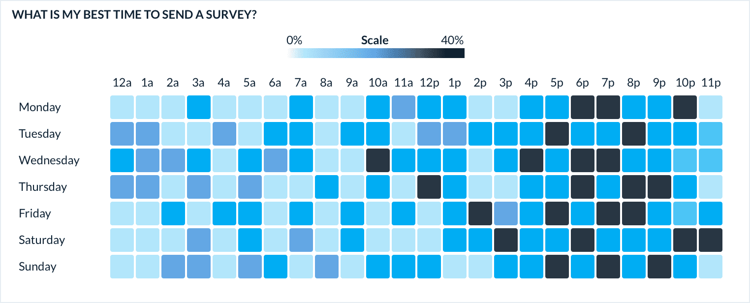
A lot of the work I did for ResponseTek involved custom data visualizations. This example is showing a heat map that allows clients to see at a glance when their best send times occur. One thing to note about these data visualizations is that I had to make sure to accommodate users that are colourblind.


